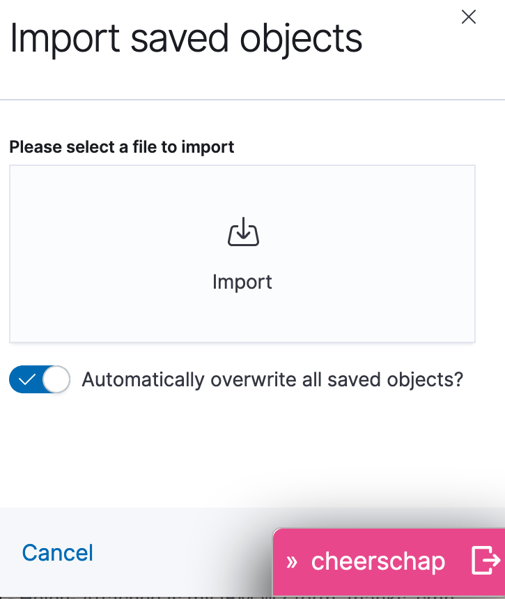
I think for a short time it was on the left side. Can it be moved back there? I had no big gripes with the color but I do get annoyed when I’m trying to do something in kibana and the logout button is on top of and completely obscuring part of the Kibana UI, such as in the import saved objects dialog:
I agree with @cmh
When creating Kibana dashboards if you want to resize the visualization in the bottom right corner, you can’t.
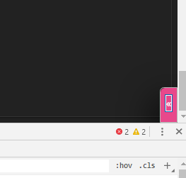
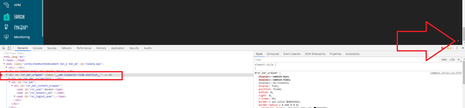
I now open developer tools in Chrome and just hide the entire logout button there.
Moving it to the left would cause other issues. Maybe you can make it moveable so the user can drag it out of the way?
What about on the left toolbar just above the “Collapse” button - so on the same column as the Discover and Visualize (etc) buttons but down at the bottom using the same arrow going out of a box icon? That should be out of the way of everything and in a good spot.
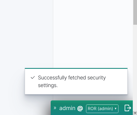
Working on a recurring problem that I really should post about and haven’t gotten to yet - I made a change to the ROR config on that tab, and when I saved it and tried to log out, the “Saved settings successfully” message popped up right on top of the logout button. Had to dismiss the error message to get to the logout button so I could test logging back in.
So yeah, anywhere but the lower right corner would be my preference.
I had the same same episode today. But to be honest I was thinking we should change the position of the pop-up notifications. Maybe higher up enough not interfer with the current position of the logout button. Way easier!
The advantage of the current solution is that it’s not positioned relatively to any UI component. This makes it cross-compatible between Kibana 6.x and 7.x and any future layout, and it still works in tablet and desktop mode, witht he sidebar collapsed or open.
So let’s try to iterate on what we have before throwing it away. What comes to mind:
logout bar could have transparency. This will preserve the affordance of any UI item that lay behind it. So people will see the buttons, minimize our bar, and press the buttons.
Opacity can go back 100% when the mouse hovers the logout bar itself, or the sidebars.
Pop-up notifications in settings app will be repositioned not to interfer with the logout bar.
@ronald.vanboven Draggable logout bar is tricky, would this thing float around wherever you leave it? Do you have examples of good UIs that work like this?
I certainly get that having it not be relative to any UI component simplifies things, but having to minimize the bar in order to get to an obscured button is the annoyance, not so much not being able to see it. Even when an apply button was completely obscured I was able to figure out where it might be pretty quickly even without the transparency. It was more the extra steps of having to minimize the bar which still didn’t move it completely out of the way, but at least allowed access to the apply button.
Moving the error messages fixes the less common case of getting a message immediately before logging out (yesterday was the first time I ran into that one) but doesn’t address the issue of the logout button consistently being over some other UI element that I need.
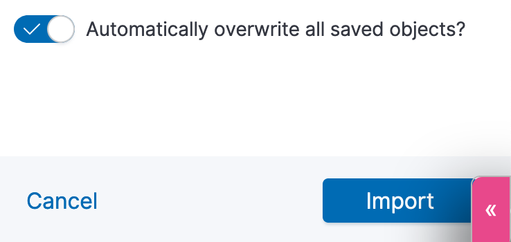
This is where I again show off how little I understand the underlying bits, but would it be possible to resize whatever UI element is on the right side that contains stuff like the apply button for a saved items import so that it leaves space on the bottom for the logout button? Resize the container so when the apply button pops up, it’s just above the logout button?
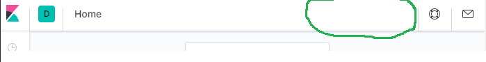
Alternately, what about up on the top title bar? There’s lots of unused space up there, and I wouldn’t mind to see the help and what’s new buttons obscured as they’re not part of normal workflow. That is, if moving it just slightly to the left of those and occupying that blank space was non-trivial.
 New multi-funciton buton themed according to ROR edition
 Example
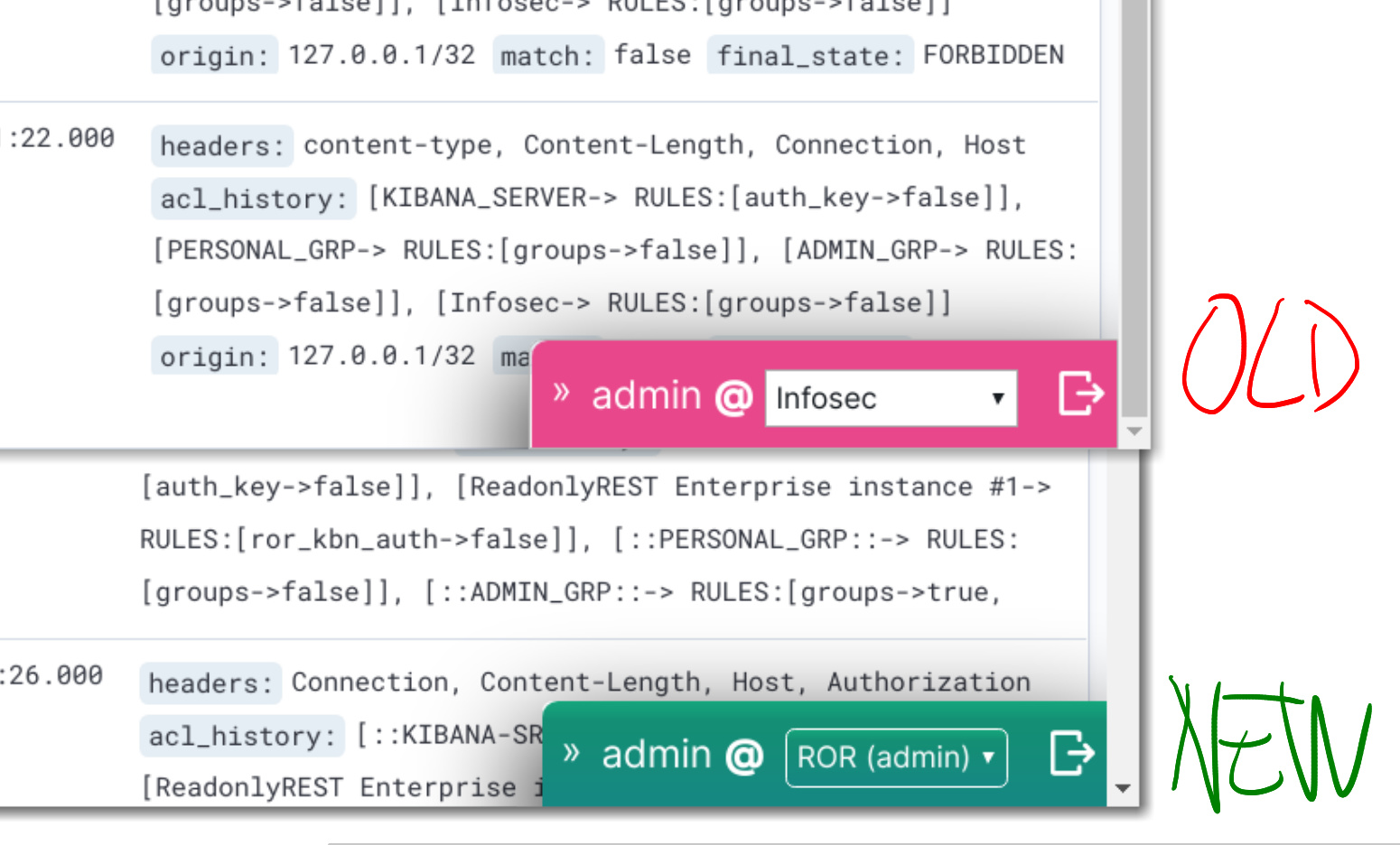

 Let’s do this?